
Cover Artist: Jorge Jiménez
Superman/Spider-Man #1 is the kind of comic that feels almost surreal just existing. These are two of the most iconic characters in the medium, and while crossovers between DC and Marvel have become more common recently, there is still something inherently special about seeing them share the page. This issue leans into that excitement by assembling a wide range of creative teams, each tasked with exploring a different corner of what a crossover like this can be.
The result is uneven in spots, but at its best, it captures exactly why these kinds of collaborations matter. When it works, it feels like a celebration. When it doesn’t, it feels like missed potential.
Truth, Justice, and Great Responsibility
Superman & Spider-Man
Writer: Mark Waid
Artist: Jorge Jiménez
Colorist: Tomeu Morey
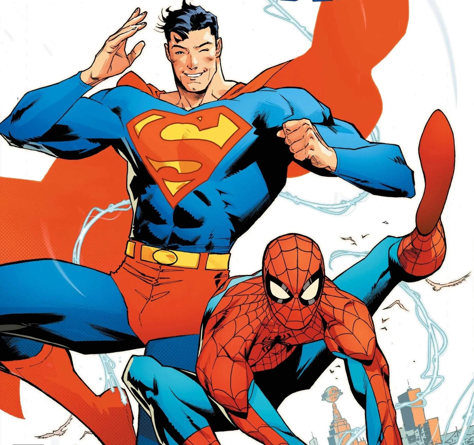
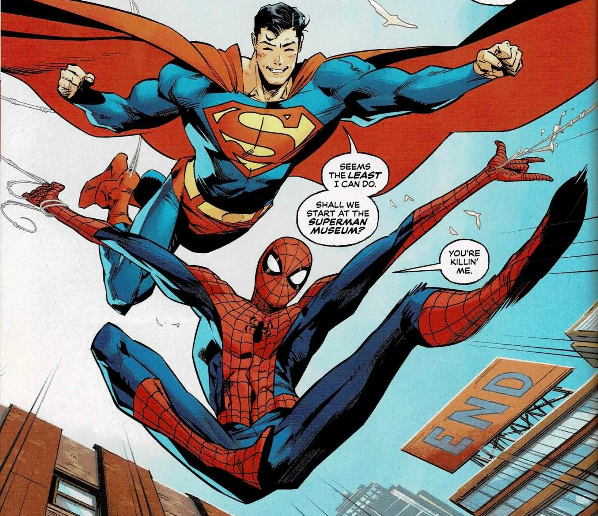
The main event pairing of Mark Waid and Jorge Jiménez is exactly what it needed to be. This is the story carrying the weight of the crossover, and it delivers in a big way. Superman and Spider-Man facing off against Doctor Octopus and Brainiac is a premise that sounds almost too perfect, and Waid leans into that without overcomplicating it.
What stands out immediately is how well both heroes are written. Superman is steady, compassionate, and quietly authoritative. Spider-Man, on the other hand, brings energy and humor without undercutting the stakes. Their dynamic feels natural, which is crucial for a story like this. There is never a moment where it feels like either character is being forced into the other’s world.
Jiménez’s art elevates everything. The action sequences feel massive without becoming cluttered, and the quieter character moments land just as effectively. Paired with Tomeu Morey’s colors, the whole thing has a warmth to it that fits the tone perfectly.
This is the kind of story people pick this book up for, and it absolutely delivers.
The World’s Finest
Lois Lane & Mary Jane
Writer: Tom King
Penciller: Jim Lee
Inker: Scott Williams
Colorist: Alex Sinclair
Tom King’s story focusing on Lois Lane and Mary Jane Watson takes a different approach, shifting the focus away from the heroes and onto the people who support them. It is a smart idea, and for the most part, it works.
The strongest aspect here is the decision to let both characters stand on their own. They are not just extensions of Superman and Spider-Man. They are capable, resourceful, and fully aware of the chaos they are stepping into.
That said, the dialogue can feel a bit stiff at times. There are moments that should land emotionally but come across as slightly awkward instead. It does not derail the story, but it does hold it back from being as strong as it could have been.
Still, there are some standout visual moments. Seeing a Jim Lee-drawn Gambit, even briefly, is the kind of unexpected treat that makes a crossover like this fun in the first place.
Jim Lee’s art brings a level of polish that keeps everything engaging visually. Even when the writing stumbles, the presentation carries it through.
Pages
Superboy-Prime & Spider-Man (Classic)
Writer: Christopher Priest
Artist: Daniel Sampere
Colorist: Alejandro Sánchez
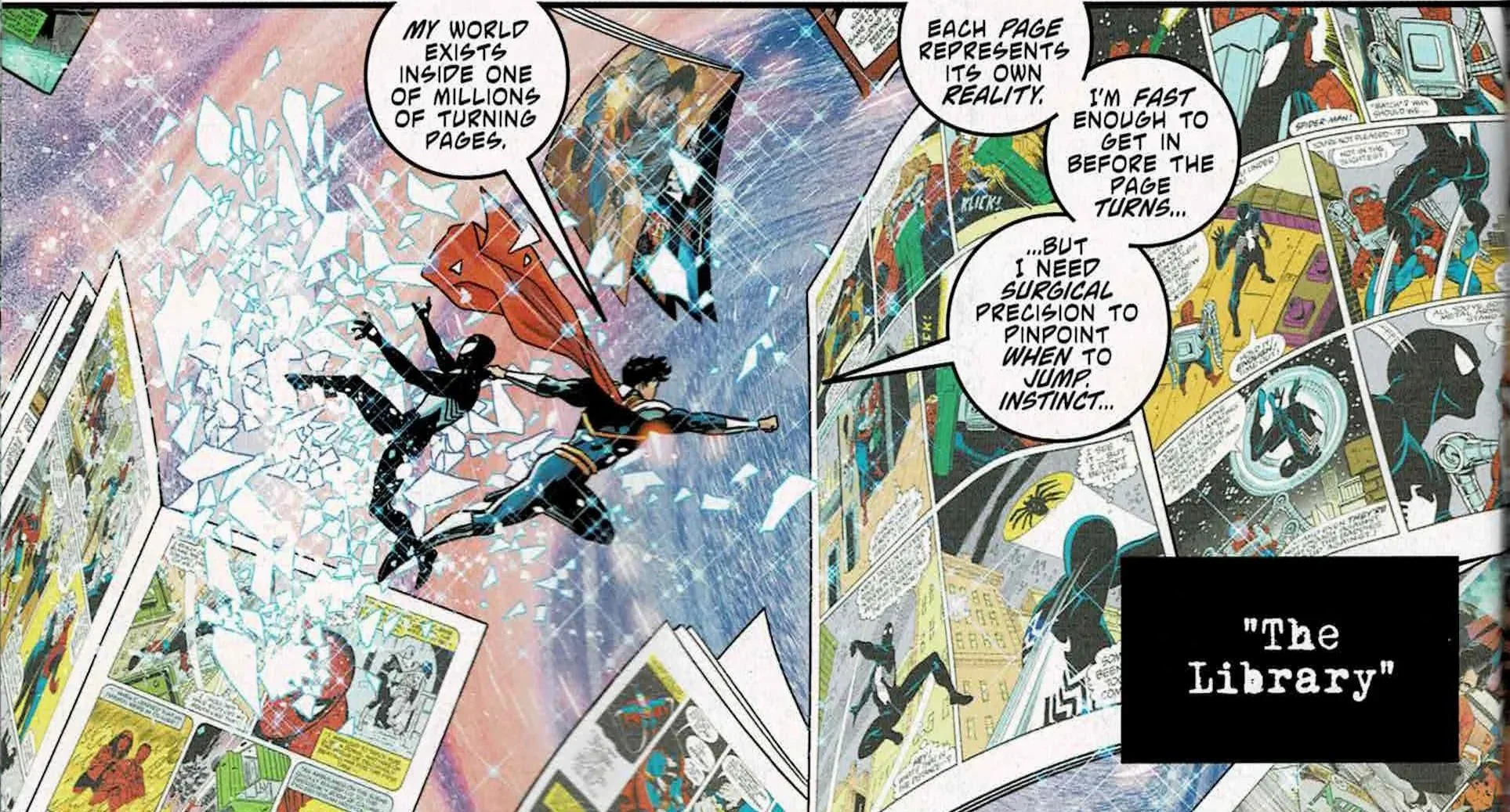
Christopher Priest’s entry is easily one of the more ambitious stories in the issue, but it is also one of the most frustrating. The idea of throwing Superboy-Prime and a more classic version of Spider-Man into a meta, multiversal narrative has a lot of potential.
I will say upfront, I am a big fan of Superboy-Prime, so his presence alone gave this story a boost for me. He is such a chaotic and interesting character when used well, and there are flashes of that here.
Unfortunately, the execution never quite comes together. The story feels overcomplicated for its page count. By the time it starts to establish its premise, it is already moving toward its conclusion, which leaves the ending feeling abrupt and underdeveloped.
There is also a disconnect between the characters. On paper, there is room for an interesting contrast, but the story never fully explores it. Instead, it leans heavily on humor, which undercuts what could have been a more meaningful interaction.
Daniel Sampere’s art is the saving grace here. The visuals are consistently strong, even when the narrative struggles to find its footing.
Beyond the Cobwebs of Tomorrow
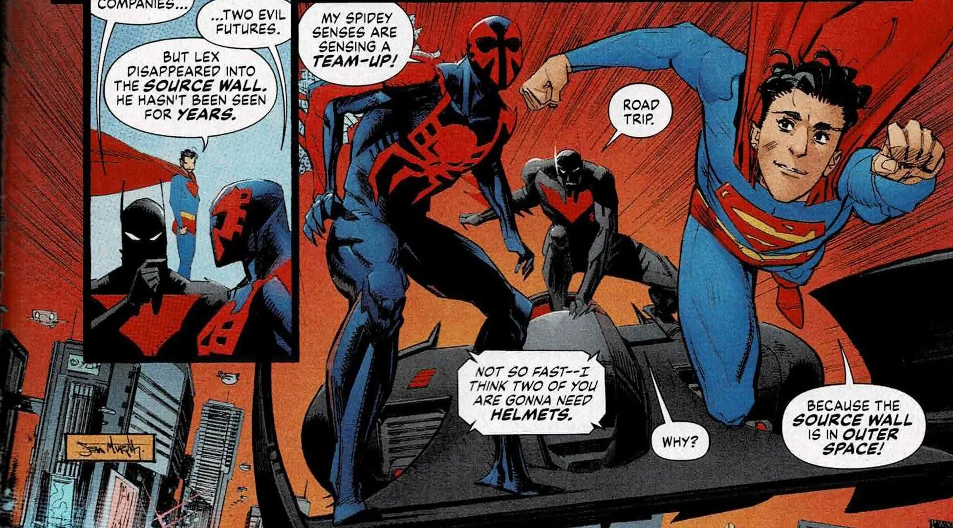
Superboy & Spider-Man 2099
Writer & Artist: Sean Murphy
Colorist: Simon Gough
Sean Murphy’s contribution is the most difficult to engage with. There are interesting ideas here, especially in the use of future versions of these characters, but the story never fully clicks.
The biggest issue is clarity. The narration is hard to follow, and the structure makes it difficult to track what is actually happening. It’s the kind of story that almost demands a second read, not because it is layered, but because it’s confusing.
Murphy’s take on the characters also feels off. There is an attempt to reinterpret them through a futuristic lens, but it ends up creating a version that feels disconnected from what makes them work in the first place.
That said, Sean Murphy’s art is very good. The sharp, stylized linework gives the world a distinct edge and adds a strong visual identity to the story. It just never quite lines up with a narrative that feels equally strong.
Jimmy Con Carnage
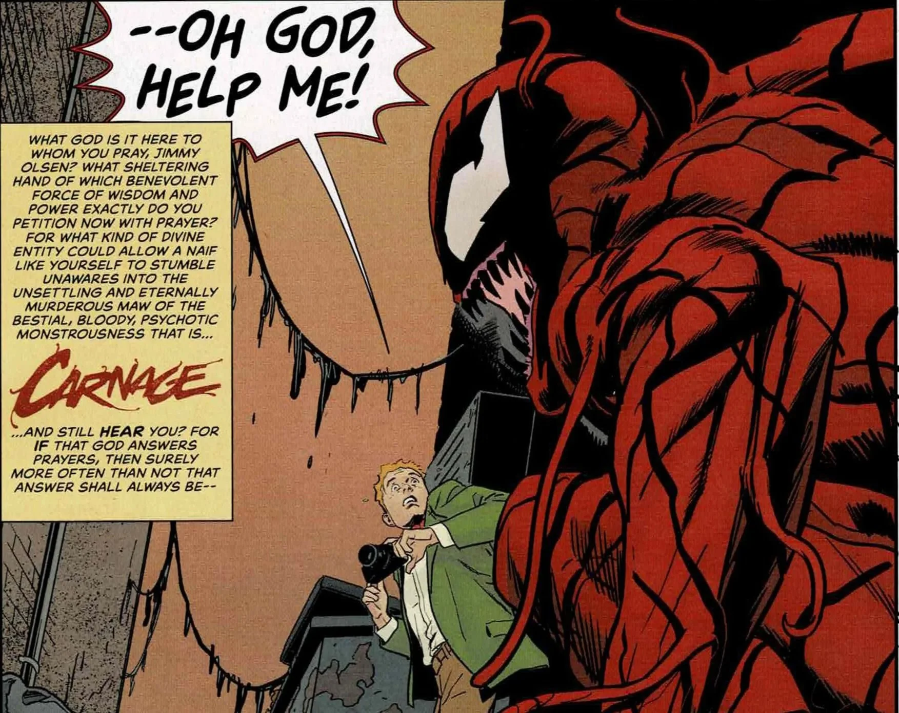
Jimmy Olsen & Carnage
Writer: Matt Fraction
Artist: Steve Lieber
Colorist: Nathan Fairbairn
This is where the book takes a sharp turn in the best possible way. Matt Fraction and Steve Lieber deliver a story that is completely unhinged, and it works because it fully commits to that tone.
Jimmy Olsen facing off against Carnage is already a ridiculous premise, and the story leans into that absurdity without hesitation. The humor lands consistently, and it never feels like it is trying too hard to be clever.
What makes it stand out is how well it understands both characters. Jimmy is chaotic in his own way, and that energy matches surprisingly well with Carnage’s unpredictability.
Lieber’s art complements the tone perfectly, giving the story a sense of exaggerated reality that fits the humor. This is easily one of the highlights of the entire issue.
The Bridge
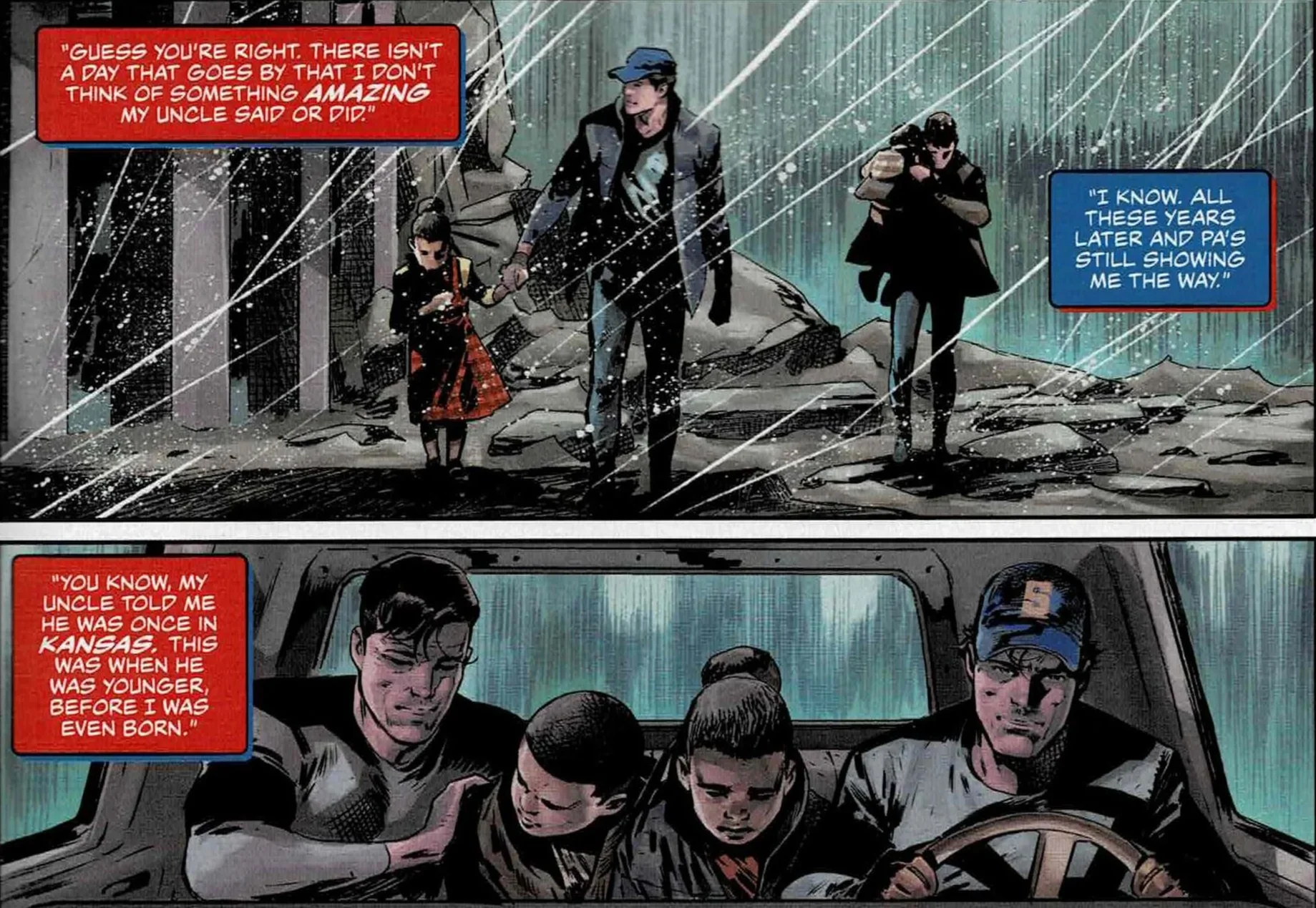
Jonathan Kent & Ben Parker
Writer: Jeff Lemire
Artist: Rafa Sandoval
Colorist: Ulises Arreola
Jeff Lemire’s story slows things down considerably, focusing on Pa Kent and Uncle Ben. It is a quieter, more reflective piece that serves as a reminder of where both Superman and Spider-Man get their sense of purpose.
Lemire is the right choice for this kind of story. He understands how to build emotion through small moments, and that approach works well here. The connection between these two figures feels genuine, even within the limited space.
Rafa Sandoval’s art adds to that tone, though the coloring occasionally flattens some of the depth in the linework. Even so, the overall effect is still strong.
It isn’t the flashiest story in the issue, but it is one of the most heartfelt.
Bias
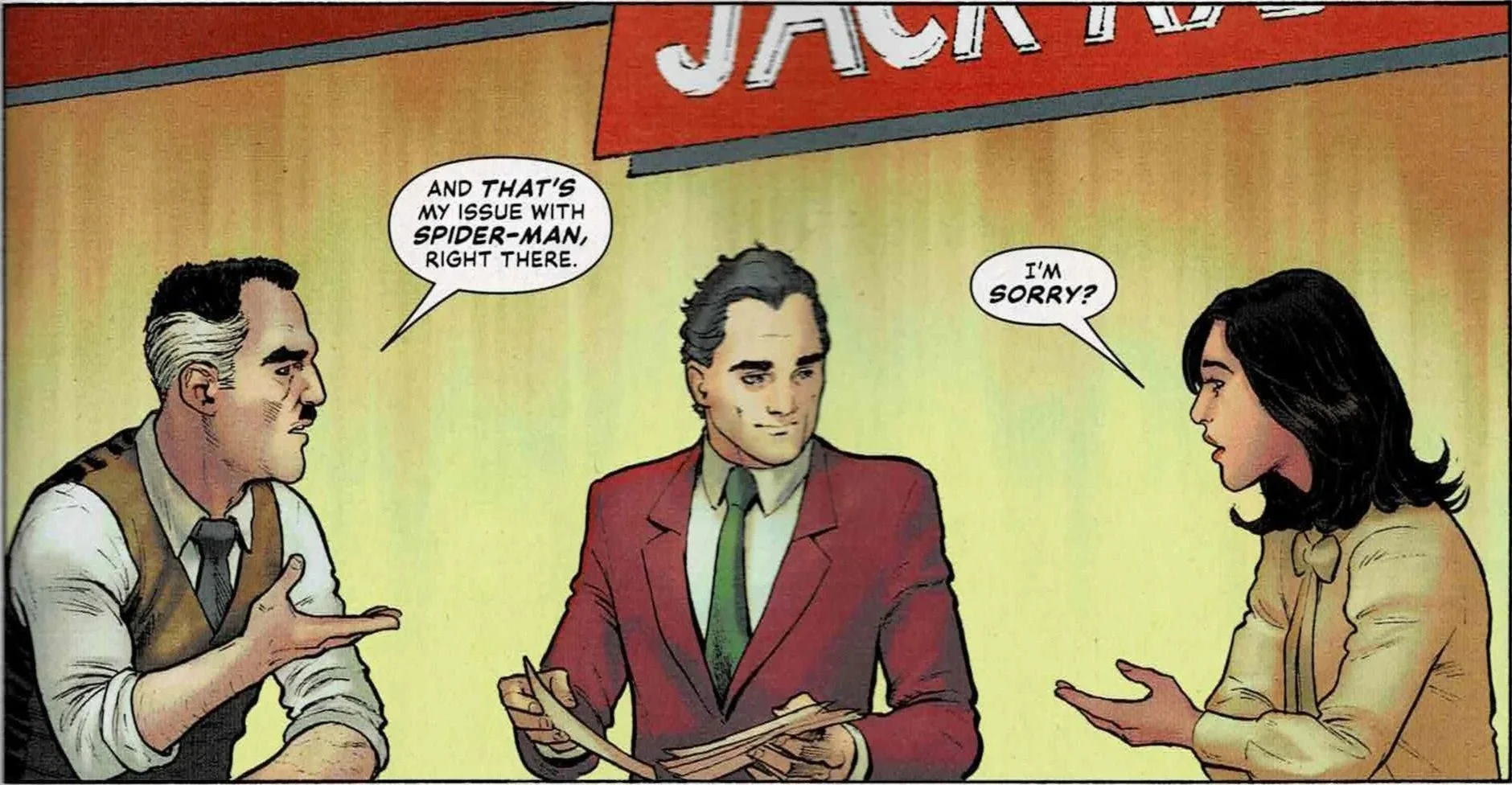
Daily Planet & Daily Bugle
Writer: Greg Rucka
Artist: Nicola Scott
Colorist: Marcelo Maiolo
Greg Rucka’s contribution shifts the focus to The Daily Planet and The Daily Bugle, centering on a confrontation between Lois Lane and J. Jonah Jameson. It is a concept that feels especially relevant, and Rucka handles it with a clear sense of purpose.
The debate between the two is engaging, highlighting the different philosophies behind how each approaches their work. It is less about who is right and more about the role media plays in shaping perception.
There is not enough space for the story to fully explore its ideas, but it does not need to. It presents the question clearly and trusts the reader to sit with it.
Nicola Scott’s art is solid throughout, even if some facial work feels slightly off in certain panels. Marcelo Maiolo’s colors help smooth things out and keep the visuals cohesive.
Blind Date
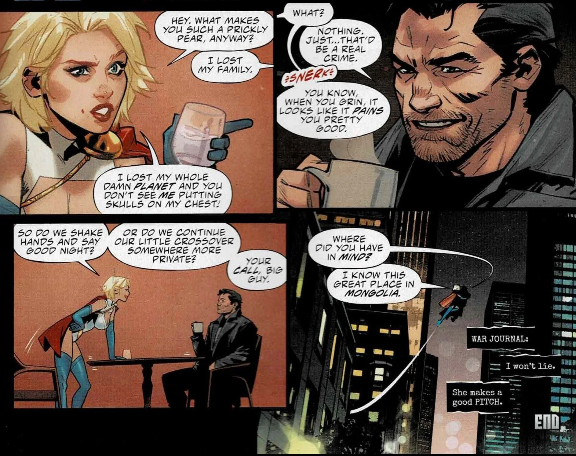
Power Girl & The Punisher
Writer: Gail Simone
Artist: Belén Ortega
Colorist: Jordie Bellaire
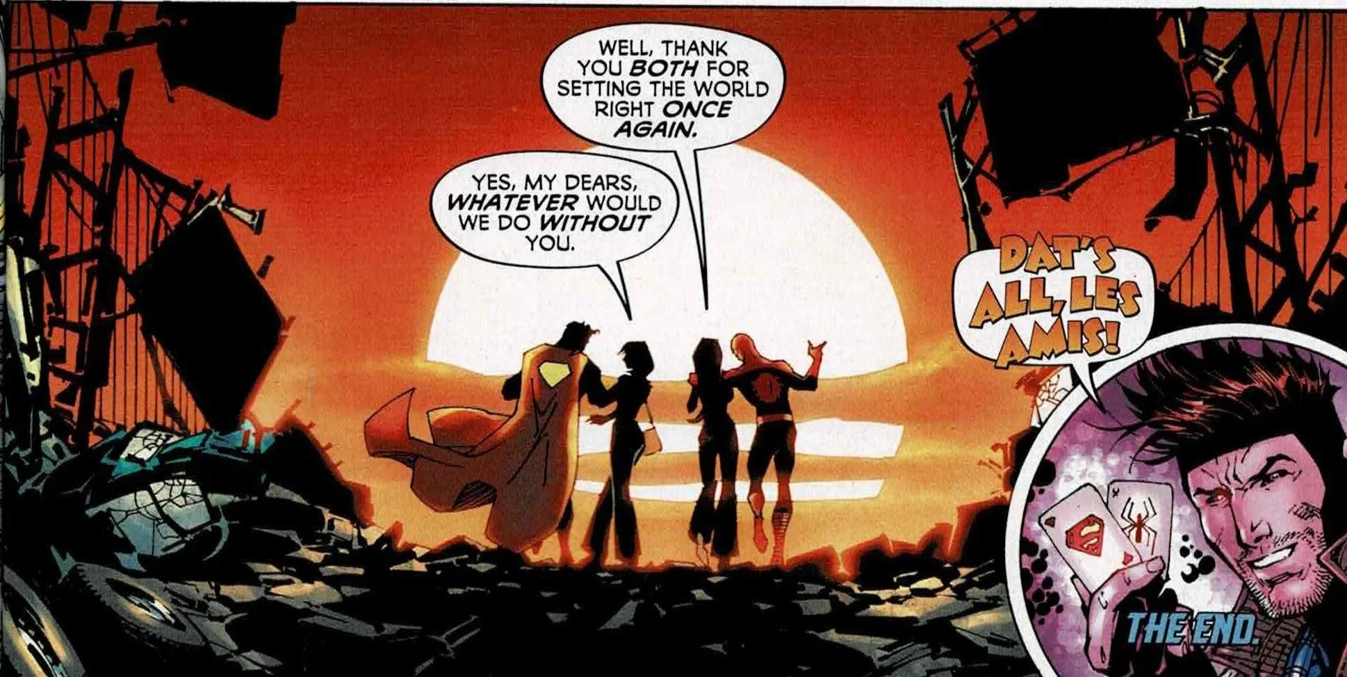
Closing the issue with Gail Simone’s story is a smart move. Pairing Power Girl with the Punisher sounds strange on paper, but the execution makes it work.
The story balances humor and character insight in a way that feels effortless. It never takes itself too seriously, but it still finds room to explore what makes these characters tick.
Simone’s writing carries a sense of confidence that makes even the most unexpected moments land. By the end, what initially felt like an odd pairing ends up being one of the more memorable parts of the book.
Belén Ortega’s art is fantastic here, capturing both the lighter and darker elements of the story without losing consistency. Paired with strong coloring, it gives the story a distinct identity that helps it stand out.
Final Thoughts and Rating
Superman/Spider-Man #1 is exactly what a crossover anthology like this should be, even if it's not perfect. Some stories soar, others stumble, but the overall experience is still worth it.
The highs are genuinely impressive. The opening story delivers on the promise of the crossover. Jimmy con Carnage is a standout for its humor and energy. Blind Date closes things out on a high note. Even the quieter entries like The Bridge add something meaningful to the mix.
The weaker stories mostly suffer from trying to do too much in too little space. When the concepts get too ambitious without enough room to breathe, the results feel rushed or underdeveloped.
Still, those missteps do not outweigh what the issue gets right. There is a clear sense of celebration running through the book, a recognition of what these characters mean and why seeing them together matters.
Rating: 8.5/10
It may not be flawless, but it is absolutely worth reading.