
Titans #30 DC K.O. Special: Swamp Thing vs. Cyborg is published by DC Comics and written by John Layman, with art and color by Pete Woods, ink by Bruno Abdias, and lettering by Wes Abbot.
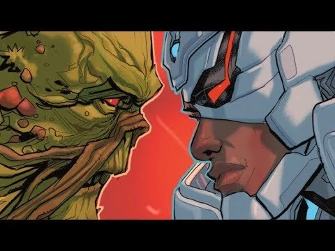
It is a frustrating experience when a high-concept "dream match" feels more like a placeholder than a pivotal chapter. On paper, the clash between Cyborg’s hyper-advanced Promethium tech and the ancient, primal power of Swamp Thing’s Green should offer a rich exploration of the "Man vs. Nature" theme. Instead, it seems we’ve hit the inevitable "event fatigue" where the tie-ins start to feel like homework rather than entertainment.
When an issue feels like a corporate mandate, the dialogue often becomes expository, and the stakes feel artificial because we know the combatants are only fighting because the plot demands it, not because of a natural character conflict.
Talking About The Plot
So, let's first discuss the plot of the book. As I stated, Titans #30 takes a detour from the team's main adventures to feature one of the many battles in DC's "Fight Month" promotion—a month where numerous titles feature one-off special matchups between DC Superheroes. So far, I've largely enjoyed these; Superman vs. Captain Atom was a massive standout for me, far exceeding any expectations I had. Whereas, as you have probably picked up, Titans #30 falls into exactly what I feared these tie-in issues would be: slop.
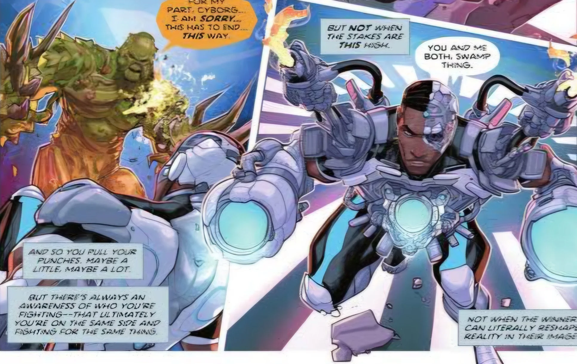
The dialogue, in particular, felt extremely generic and predictable, with very little thought given to these specific characters or the unique nature of this matchup. It felt like generic fighting game "grunt" dialogue. Aside from a couple of lines, these characters are almost interchangeable with anyone else. This is a real shame because, as I've already stated, this is an interesting matchup with a lot of potential.
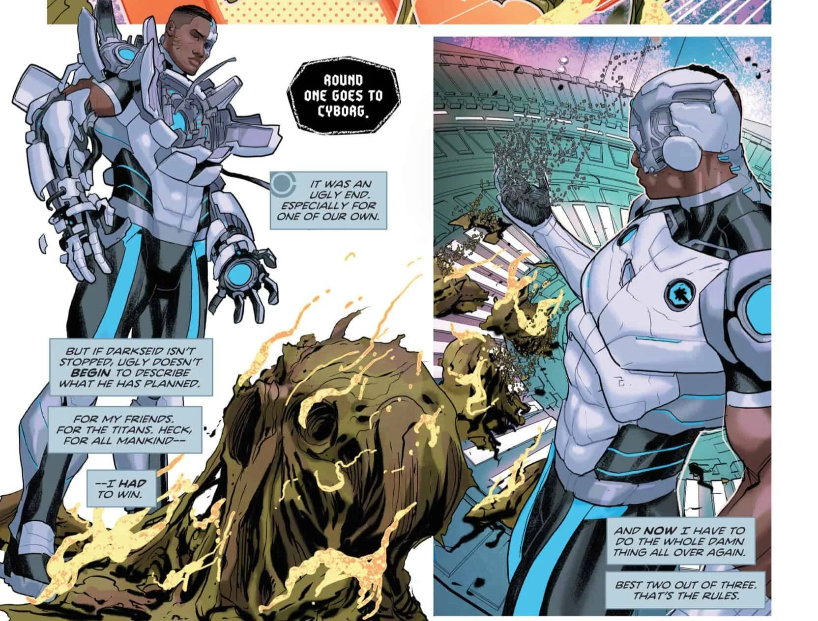
It feels as though the writer approached this comic with a "half-assed" attitude and really phoned it in. I have read this book twice to prepare for this review, and I can barely remember a single line of dialogue exchanged within it. Whether it's the corny, DBZ-esque "I let you win that round to study you" or the cliché "You gotta show Darkseid what you just showed me!"—nothing at all stood out.
The B Plot
There is also a side story running through the comic that seems to follow the main narrative of the event, in which Arsenal, his daughter (Lian Harper, though the book does a poor job identifying her), and Wonder Girl must secure Earth from the Apokolips Core—I think. I say "I think" because this subplot was poorly explained, even to someone who has been following the K.O. event fairly closely.
To me, this side story feels especially clunky and ill-fitted. It takes away from the battle, which—I should remind everyone—is meant to be the main feature of the book. This inclusion makes the issue feel even chunkier and more poorly paced than it already did. I thought the entire point of "
The Art of The Fight: Talking About The Artwork
Now, onto the art of the book. I’d say the work done by Pete Woods and Brian Abdias is generally pretty good; I like how these characters look and are captured stylistically. However, the art really falls short by missing the opportunity to take advantage of the issue's specific gimmick: the heroes are allowed to switch to a suit or design from any era of their history for the fight.
Yes, this is largely fan service that serves no deeper narrative purpose, but it’s cool! What can I say? While we see Cyborg receive this choice, the variants shown look very much the same, aside from one or two. I did spot his classic Cartoon Network Teen Titans look in the background, but otherwise, they were completely interchangeable. We didn't even get to see Swamp Thing’s choice, which feels like an enormous waste of potential.
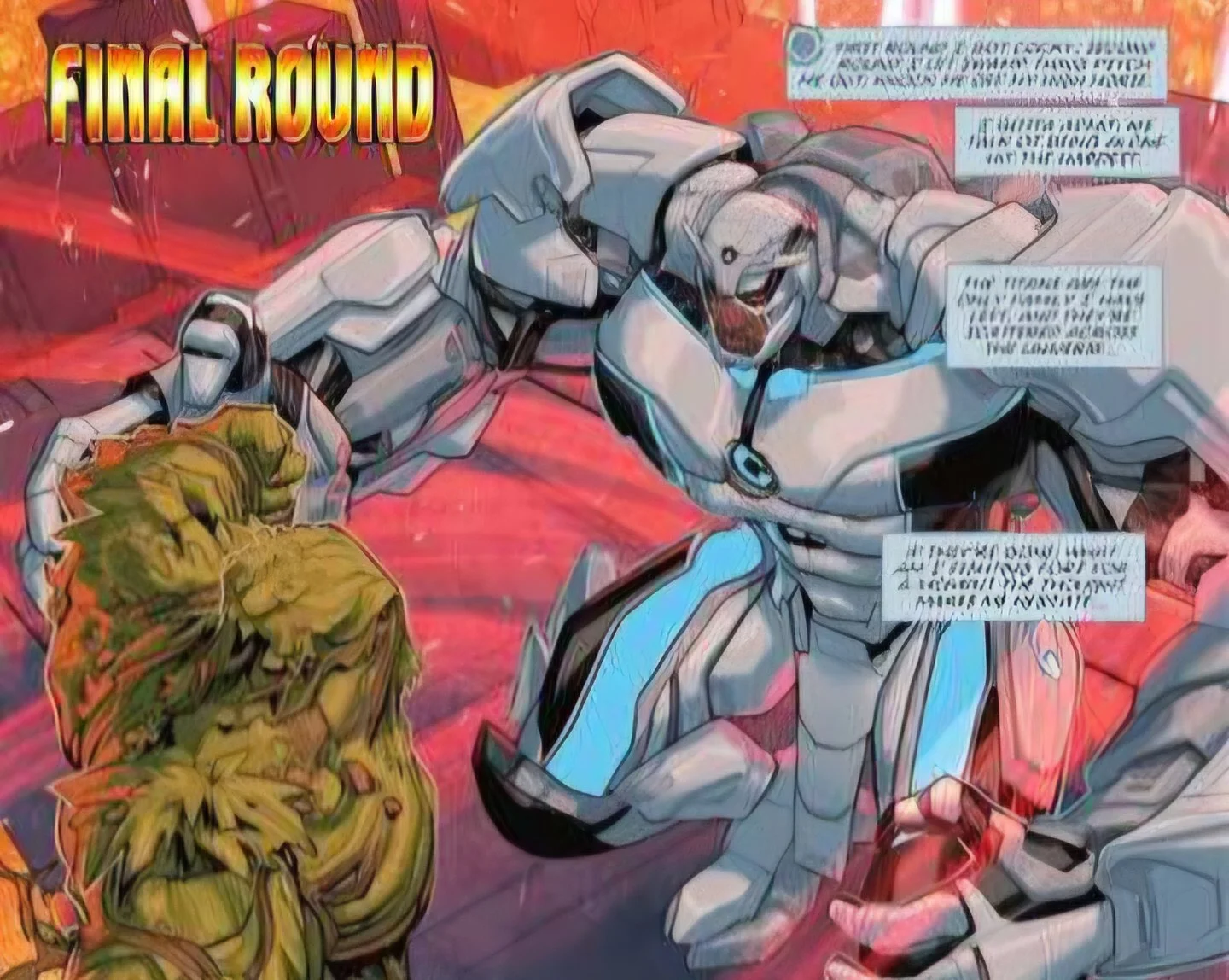
I also feel the art fell short in terms of choreography and special powers. Cyborg uses a power shield and a beam, while Swamp Thing fires... darts? That’s it? Talk about a lack of creativity. By comparison, the Superman vs. Captain Atom special was far more exciting and took cues from manga in its framing and panel layout. Even the Wonder Woman vs. Lobo special used creativity and absurdity to craft something memorable.
All in all, this comic was pretty poor and easily the worst of DC K.O. yet. Maybe someone else will get a kick out of it, but I certainly didn't.