
I know they say not to judge a book by its cover, but take a look at the cover of “Spirit of the Shadows” #1. How could you see that on the shelf and not go, “Wow, that looks cool, I wonder what it’s all about?”
It’s very cool.
Bright colors, creative panel layouts, an imaginative setting, compelling characters… this one has it all.
Personally, I think you should just make my word for it and run out to buy a copy now. But if you need to know more first, then read on.
It’s a Wonderful (After)Life
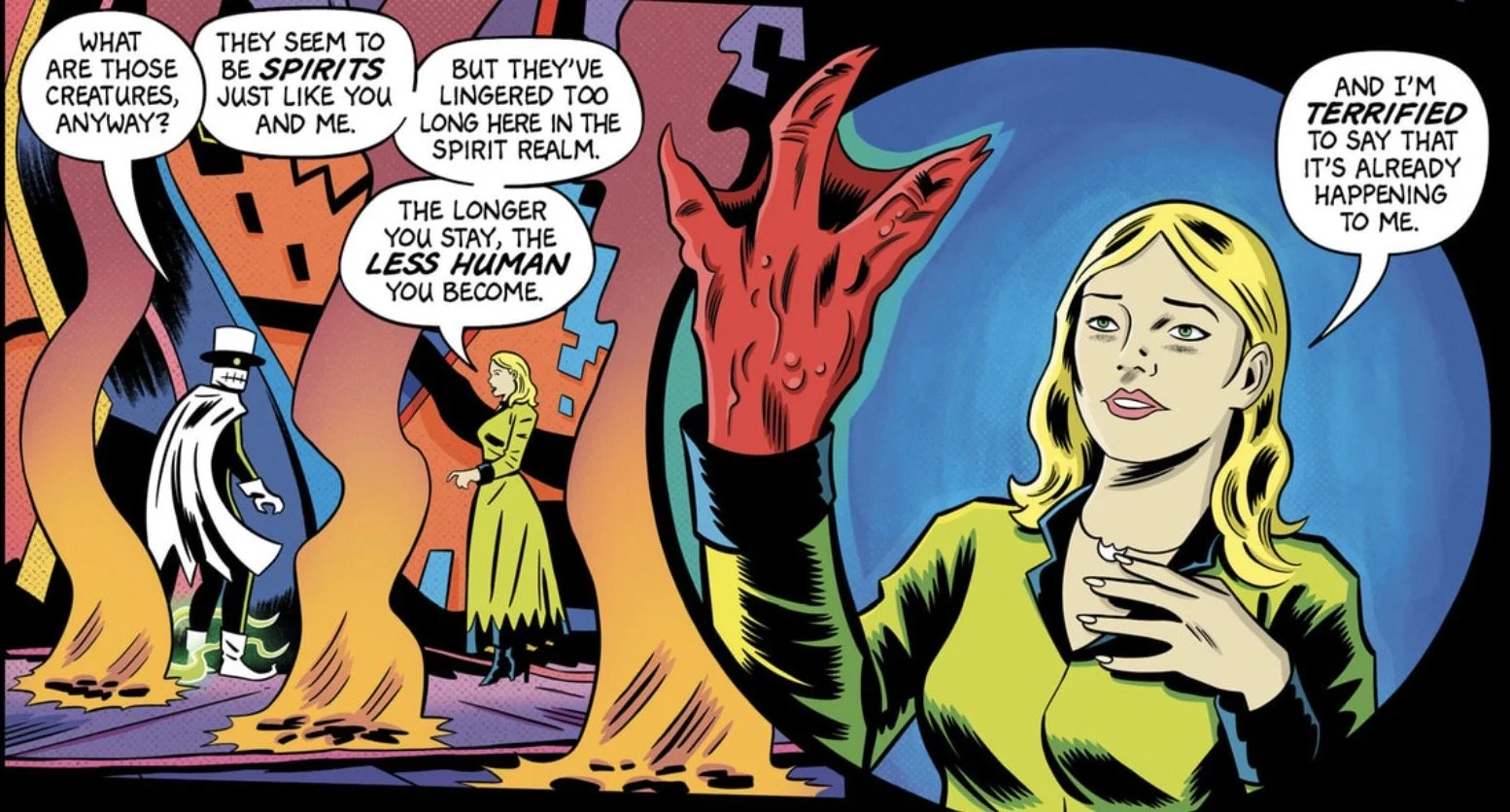
We’re immediately greeted with the caption “Somewhere out of time and space…” in a colorful landscape that looks like the movie What Dreams May Come if Jack Kirby had done the art design. Erik and Katrina are reunited after what must have been a long time, but their happy reunion is quickly interrupted by a creature that resembles DC’s the Creeper, who bursts from the ground and grabs Erik’s leg!
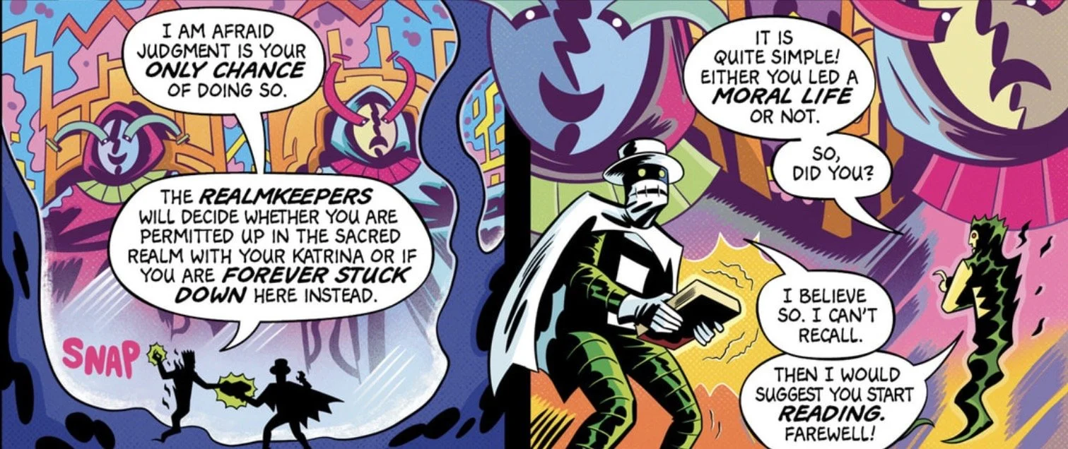
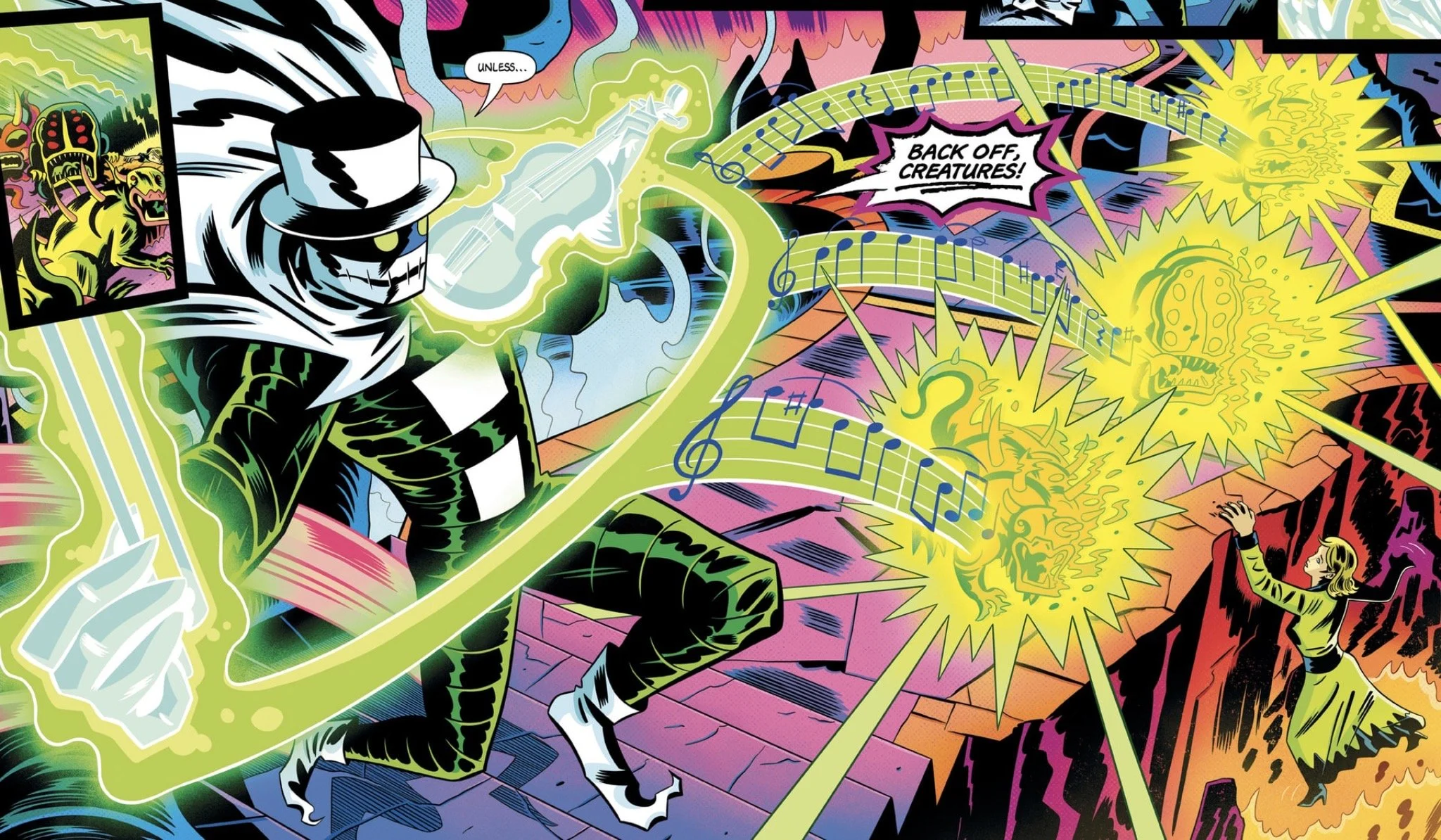
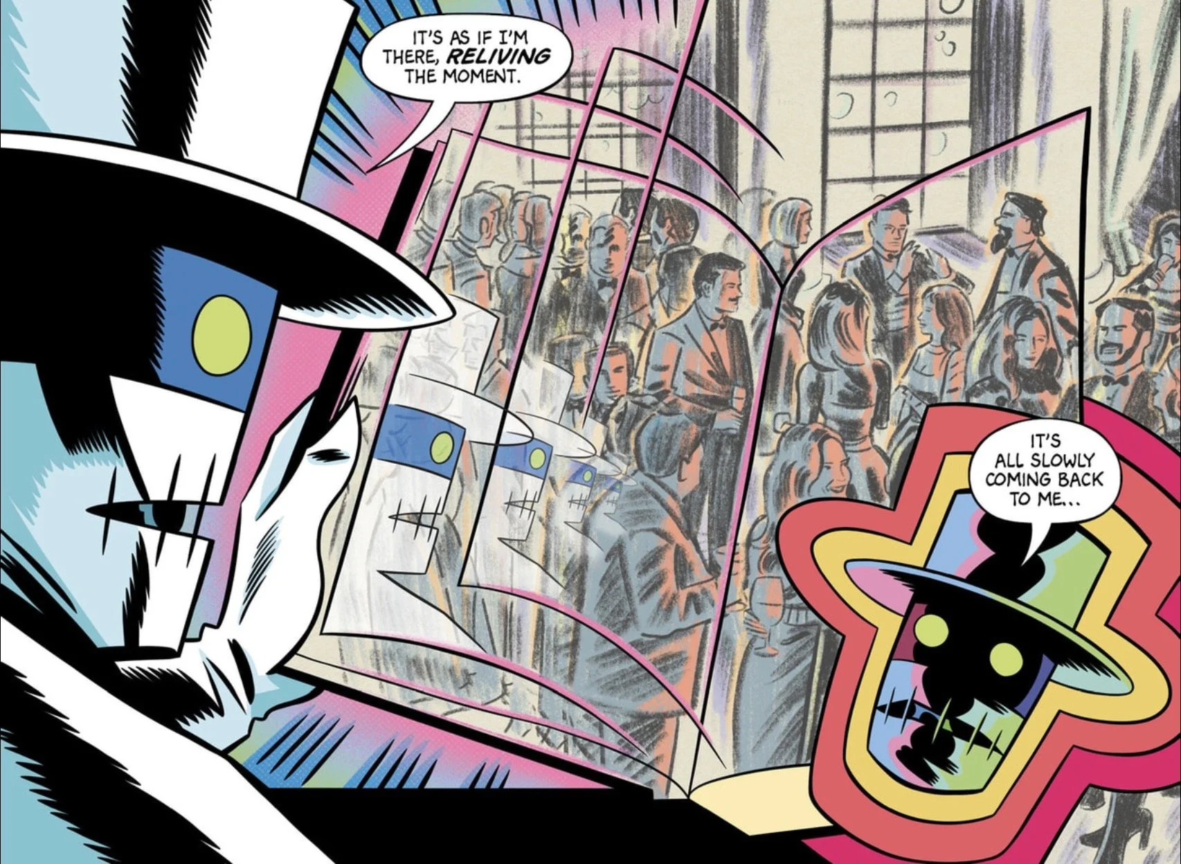
It seems that our reunited lovers are both dead—Erik recently so—and in order to leave this Spirit Realm and return to the Sacred Realm where Katrina awaits, Erik must first review the book of his life and then face judgment. As he starts to read the book, Erik finds himself magically reliving the memories contained within. Until, that is, a horrible beast tears the book from his hands and rips it to shreds! How will he face judgment and return to his Katrina now?
Meanwhile, in the land of the living, Dr. Hyde Perkins finishes burying Erik’s body (clad in the same bizarre cape-and-mask garb he wears in the Spirit Realm) and returns to Crescent Manor, which greets visitors with a sign reading “Beware the Spirit of the Shadows.” Soon, he has a visitor, and the nature of his relationship with Erik starts to become clear. Are these two men, now separated by life and death, the heroes of this tale, or are they themselves villains?
A Virtuoso Tale
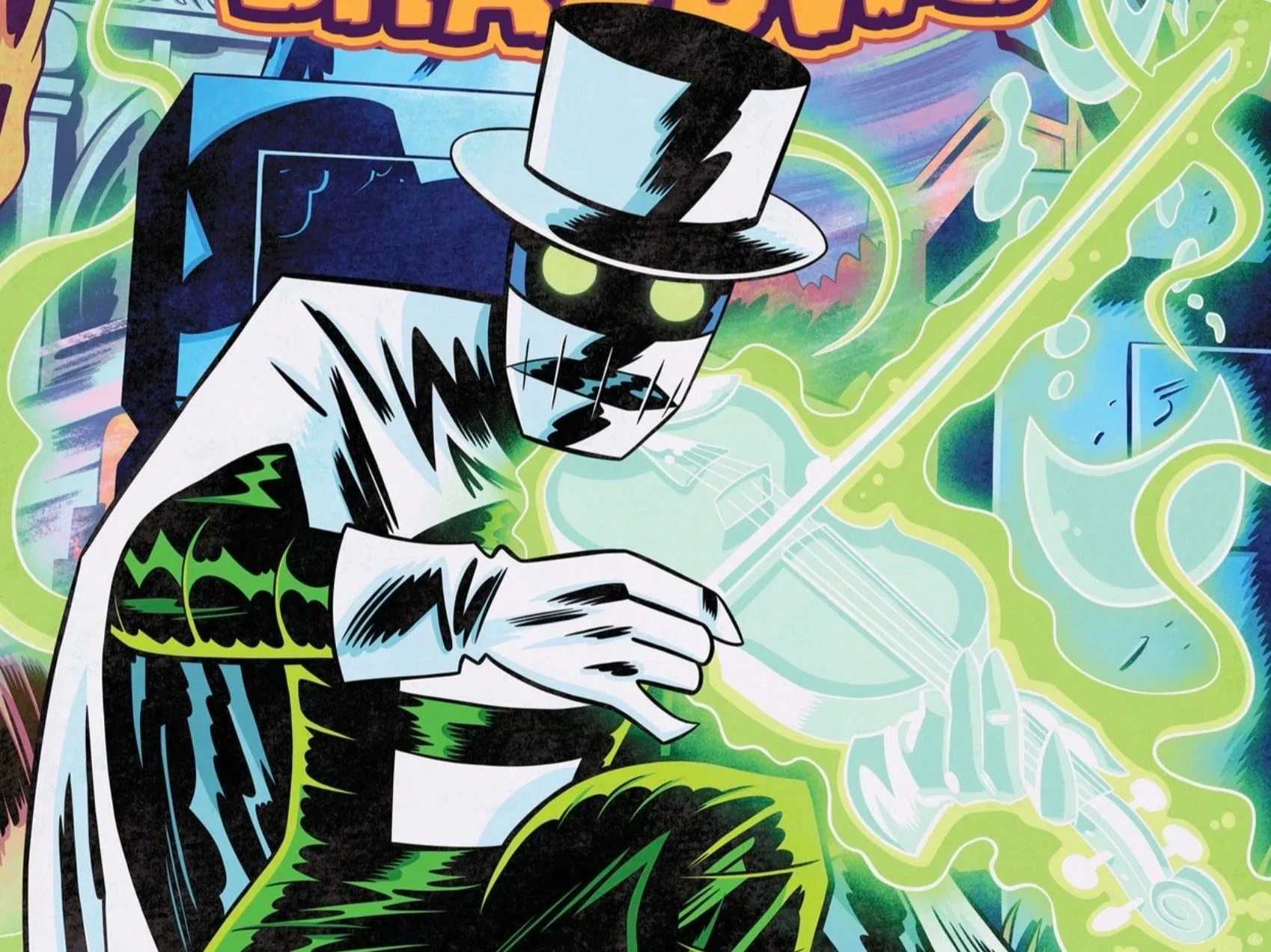
This was a fantastic comic book. The story flows well, briskly paced but not too fast. The characters are all interesting, and the conceit of the newly deceased having to remember their lives before standing for judgment allows us to learn about Erik as he rediscovers himself. The setting is bright and colorful, with creative designs for the “landscape” and the creatures contained within it. Erik’s “costume” is a striking design, and the manifestation of his spiritual abilities is a very cool effect. The end-of-issue reveal would probably have been obvious to even my cat, so I doubt it’s going to surprise anyone, but that doesn’t mean it isn’t a strong reveal that promises to take the story in interesting directions.
If I had to nitpick something—and I’ll talk about this more in the art section—it is that the two major female characters in this story look incredibly similar. The more I think about it, the more I think that’s on purpose, so I might retract that complaint later if I’m right about one aspect of the story.
I’m trying hard not to give away too much of the plot, because it really does build in just the right way, and I want you to be able to experience it for yourself. Suffice it to say, for a story that clearly has some really dark undertones, this book is a ton of fun.
Spiritual Guides
The creative team for this book is a two-man powerhouse—Daniel Ziegler and Nick Cagnetti both handle writing duties, while Cagnetti also takes care of the art and colors. Ziegler appears to have no other works to his name, while Cagnetti did something called Pink Lemonade for Oni Press in 2022. For such a neophyte team, this book is really well put together.
On the writing side, there is no narration to speak of; the story is moved along by action and dialogue. Each character has a distinct voice, and the pacing is brisk without feeling like they’re rushing to get to the next thing. There are lots of ideas and concepts bouncing around in this book, and they all make sense and clearly had some thought put into them.
The writing is good, but the art and the colors are where this book really shines. Cagnetti’s style immediately reminds me of Tom Scioli’s, which is itself reminiscent of Jack Kirby’s. Not a bad style to resemble! Other than the main female characters looking too similar—which I really do think is on purpose—everyone has a unique look and something that makes them stand out: Erik’s costume, Perkins’s beard, etc.
The colors are the perfect complement to the art. Bright and colorful with a varied palette, they just add to the surreal, almost Kirby-esque look. In the flashback sequences, the colors are more muted, which makes these sequences stand out and is when the art most resembles Scioli’s. All in all, for a freshman effort for this team, this is an incredibly well-done book.
The Spirits Within
I can’t say enough good things about Spirit of the Shadows #1. From start to finish, this is a spectacular comic book that I think everyone should check out. The writing is solid, the pacing is brisk, the setting and characters are fantastical, and the art and colors are terrific.
In other reviews, I’ve lamented the lack of originality in comics today and mentioned that there are only seven original ideas, with everything else being variations of them. So, the twist, the hook, and the panache that you bring to those ideas are what make your work stand out. This book is exactly what I think there needs to be more of—not necessarily new ideas, but new presentations of old ideas in a unique style.
Don’t get me wrong, I enjoy reading “Big Two Publisher’s Absolute Ultimate Secret Crisis” as much as the next guy, but thanks to Hollywood giving us all superhero fatigue, I can’t subsist on that alone anymore. I need something different, something to engage my imagination and maybe tug on my heartstrings a bit.
That’s what this book is. I feel like I’m starting to repeat myself, so I’ll finish with this: please, give Spirit of the Shadows a shot. No matter what your taste, I really do think you’ll find something in here that you’ll like. If you do, I’d love to hear about it.