
Blue Falcon & Dynomutt #4
Writer: Jimmy Palmiotti
Artist: Pasquale Qualano
Colors: Jorge Sutil
Cover: Lucio Parillo
Issue #4 of Blue Falcon and Dynomutt feels like the moment the series finds its true identity. What began as a jarring mix of cartoon nostalgia and serious superhero violence has started to blend into a cohesive tone that feels purposeful rather than conflicted. This issue delivers strong pacing, stylish action, and real momentum, while also showcasing the best cover and interior art the series has offered so far. The creative team leans fully into treating these classic characters seriously, and for the first time, it completely works for me.
Where We’re At So Far

The masked hopsital assailants from Issue #3 kill a policeman protecting Blue Falcon.
The first three issues function largely as an extended origin story for Dynomutt, with Blue Falcon’s world slowly being built around him.
Issue #1 opens with a violent battle between Blue Falcon and some airborne foes, before revealing it is a nightmare. Then we’re dumped into the world of Radley Crown and his best pal, Dyno. The excitement of seeing these characters return feels genuine, especially for anyone who grew up watching the cartoon. The story shows Dyno as a normal dog instead of the metallic hero fans remember. When intruders break into Radley Crown’s lab looking for an anti-gravity belt, Dyno is shot and killed while trying to protect his owner. It is a dark and tragic choice that establishes the main tonal divide that initially bothered me. These are characters that once lived in a light-hearted, goofy world, but now they are being placed in a much harsher and more violent reality.
That said, the character work in the first issue is excellent. Radley Crown is portrayed as joyful, enthusiastic, and genuinely happy with his life. He is not a brooding loner in the mold of Batman. His bond with Dyno is the emotional core of the story, and the art makes that connection feel real through expressive body language and facial details.
Issue #2 takes a massive tonal leap forward. Radley refuses to lose his best friend and attempts to save Dyno by transferring his consciousness into a robotic endoskeleton. Dynomutt is born here, but not in triumph. He is created out of desperation and grief. At the same time, Radley embraces his role as the Blue Falcon in a more serious way, declaring war on crime in Big City. The scale of the story expands with hints of a larger villain operating in the shadows under the name “The Beast.”
This is also where the violence becomes more noticeable. The comic starts blending retro superhero aesthetics with modern action storytelling, and at first, this clash felt awkward to me.
Issue #3 shifts the focus more strongly onto Blue Falcon as a hero in action. After saving a bus full of civilians from an explosion, he winds up critically injured and rushed to the hospital. The danger around him feels real, and the book leans even further into suspense and threat. Dynomutt begins to feel more like a protector than a sidekick. The world feels less like a cartoon and more like a grounded superhero city with real stakes.
By the end of the third issue, the tone is still uneven at times, but the foundation is clearly stronger.
Issue #4: Where It Hits Its Stride
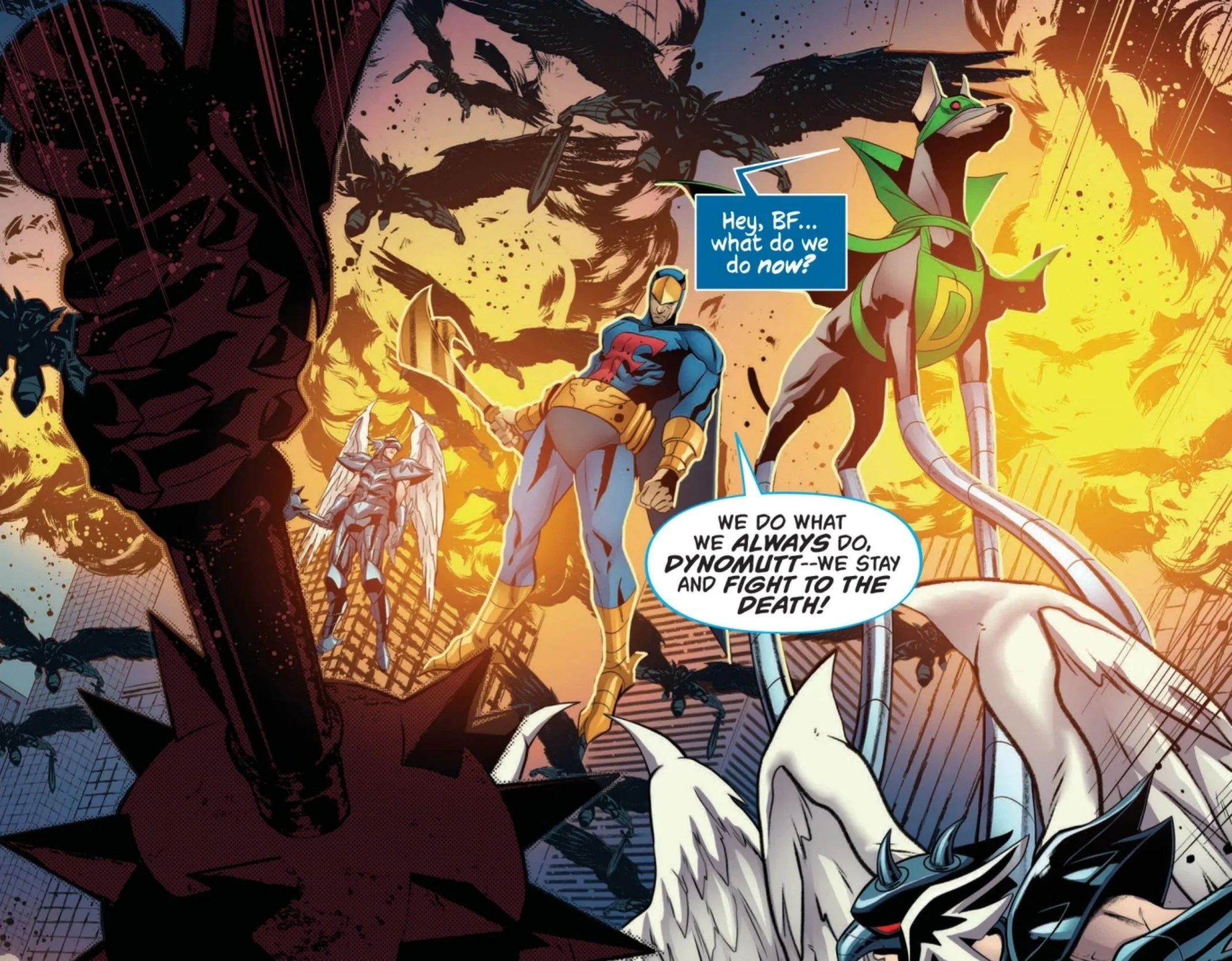
Blue Falcon’s nightmare that opens the issue.
Issue #4 opens with what looks like a full-scale military assault, only to reveal it is a dream sequence, the very same sequence that opened issue #1 of the series. This is a smart way to establish the theme of the issue: Someone is coming. They have funding, resources, and reach. The danger is not random crime anymore. It is organized, targeted, and escalating.
Blue Falcon is recovering at home after the hospital attack. He is physically vulnerable and strategically compromised, because the anti-gravity belt has been stolen. The woman responsible is not just a thief, but someone capable of turning that technology into something far more dangerous.
Maya Vincent steps into the story more directly here. She is not portrayed as a passive supporting character. She actively tracks down where the stolen tech might have gone, even knowing she could be walking into serious danger. This gives the book a stronger sense of agency across all the characters, not just the two leads.
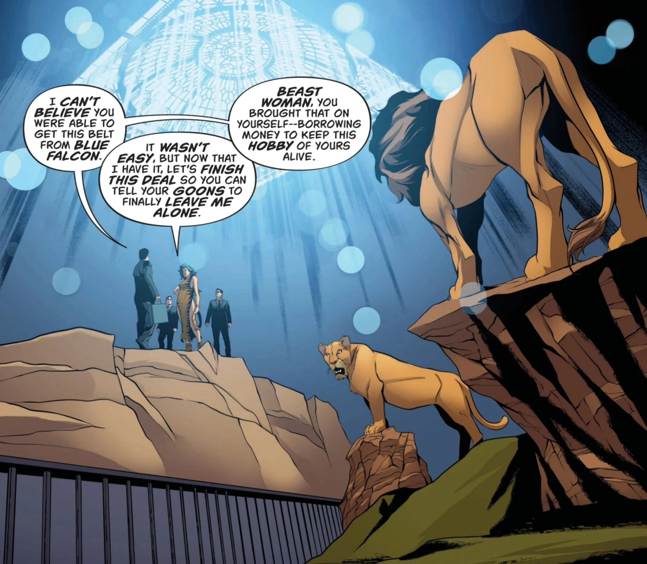
The one who organized the theft of the belt is revealed to be Radley’s current girlfriend, Violette Valentine, also known as Beastwoman, a classic foe of Blue Falcon and Dynomutt. She captures Maya and takes her to the Amazon. Little does Beastwoman know, Falcon and Dynomutt have followed her and are planning to get Maya back by any means necessary. The issue ends with the beginning of a confrontation between the two parties, leaving me excited for the fifth issue.
Tone Shift: From Clash to Blend
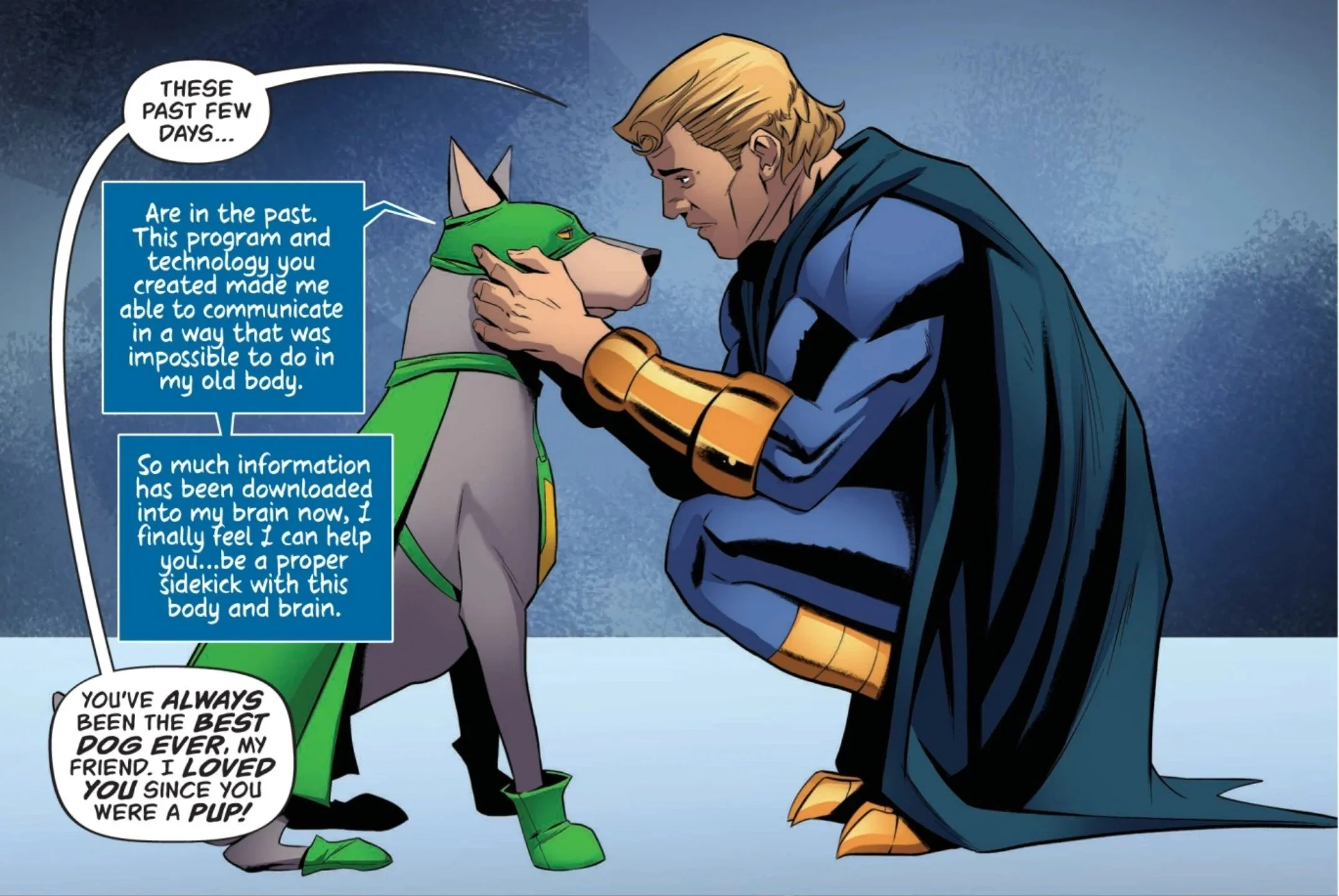
Radley and Dyno share a touching moment after a rough few days.
The biggest change for me personally is how the tone is finally working instead of fighting itself.
Early in the series, the collision of cartoon history with serious violence felt uncomfortable. Seeing characters that once lived in a goofy, harmless world now exist in a space with blood, threats, and moral weight felt wrong at first.
By issue #4, that tension feels intentional and effective. Instead of clashing, the tones now complement each other. The lightness of the character dynamics, especially between Radley and Dynomutt, works as contrast rather than contradiction. The story feels like a mature evolution of the source material, not a rejection of it.
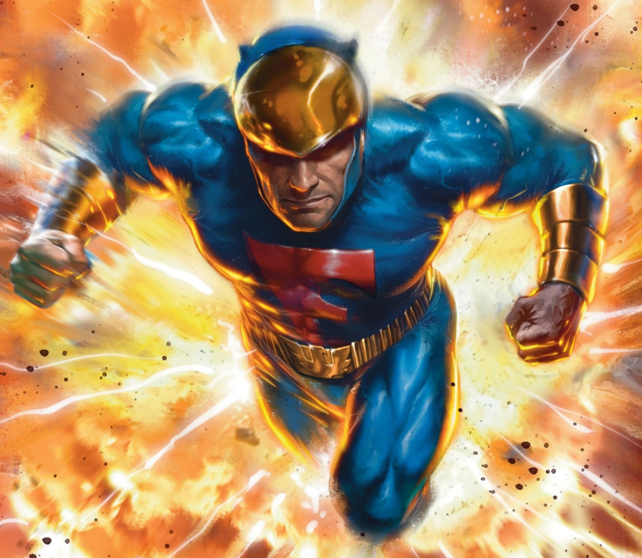
Lucio Parillo’s Cover Art
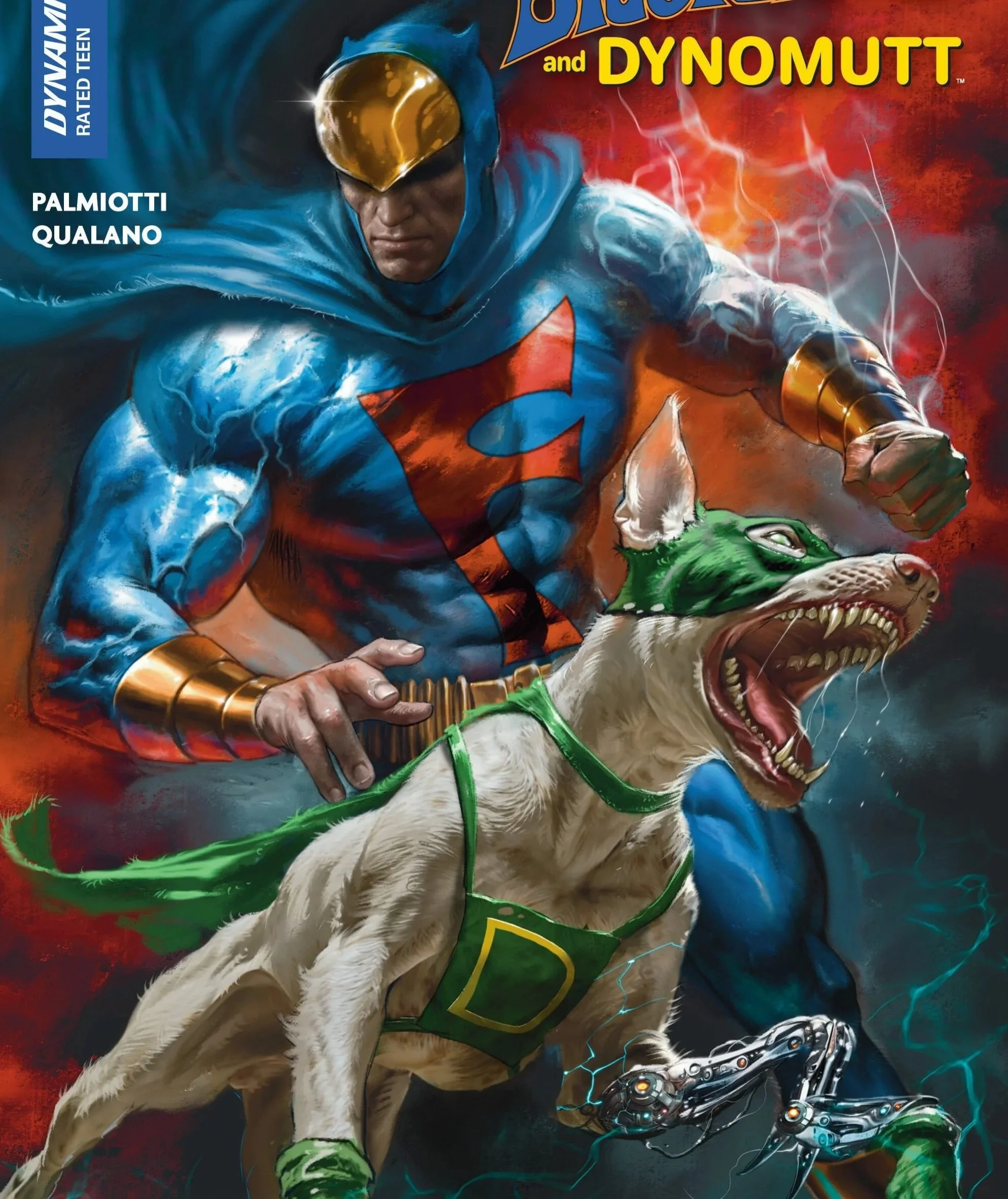
Parrillo’s cover for Issue #2, featuring a very aggressive Dynomutt.
One of the standout elements of this issue, and the series as a whole, is the cover by Lucio Parrillo.
The cover does an excellent job of signaling what kind of book this really is. This is not a joke comic. This is not a parody. The lighting, posture, and intensity of the composition all communicate that this is a serious take on these characters. It helps bridge the mental gap between childhood memory and modern storytelling.
The cover feels cinematic and dramatic, and it sets the tone before you even open the book.
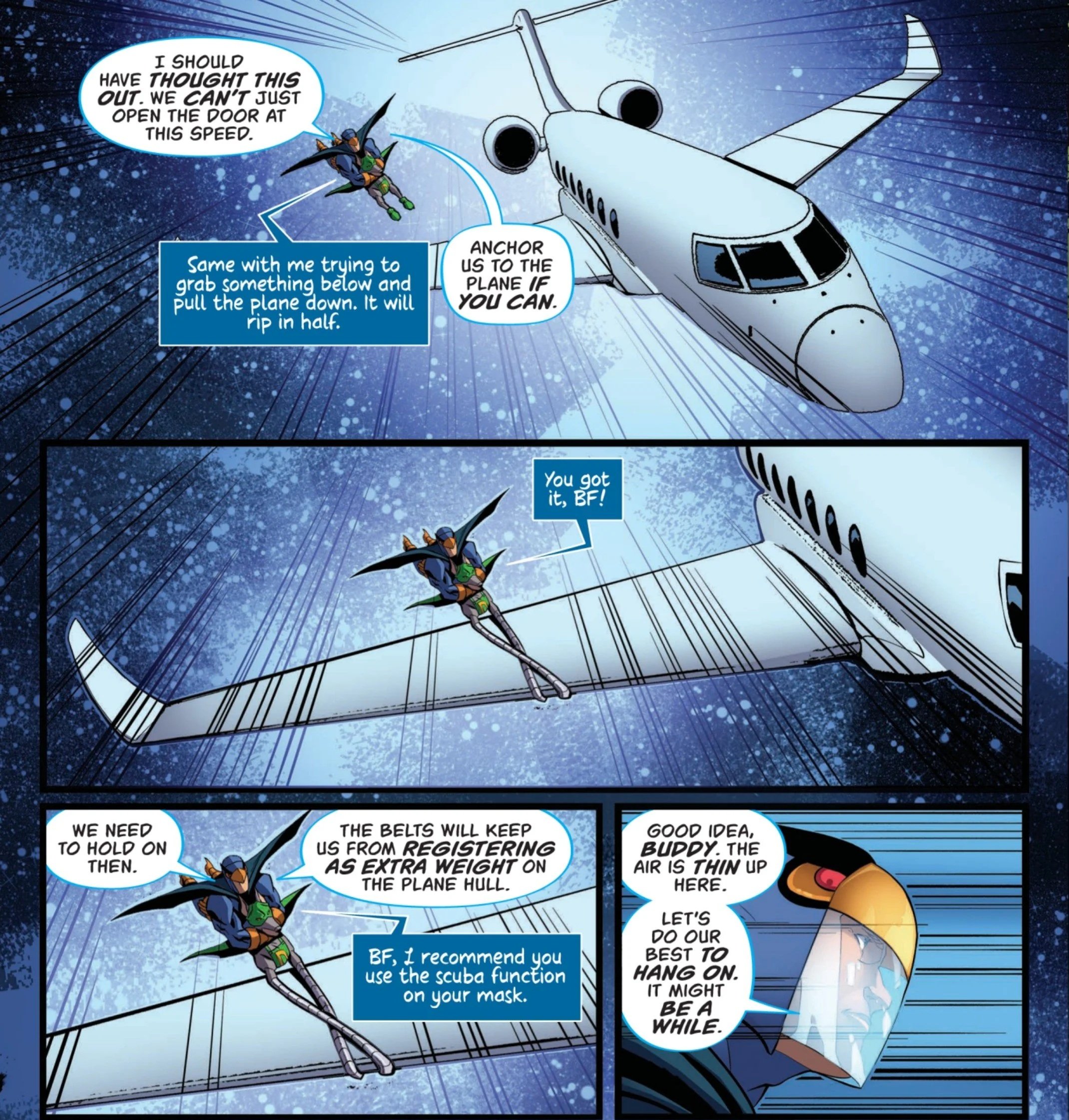
Qualano and Sutil’s Visual Sorytelling
An example, from Issue #4, of Qualano and Sutil’s excellent work in bringing the story to life.
Pasquale Qualano’s interior art continues to impress, but in this issue it feels more refined and confident.
The action is staged using smart angles and clean, readable motion. Even when Blue Falcon is not moving much physically due to his injuries, the panels still feel dynamic because of how the scenes are framed.
Jorge Sutil’s colors give the book depth and texture. Backgrounds feel detailed and immersive rather than flat. Big City finally feels like a place rather than a placeholder name. The lighting and color choices create a mood that supports the story, especially in quieter scenes where tension is built through atmosphere instead of action.
This issue feels visually polished and cohesive in a way the earlier issues were still building toward.
Palmiotti’s Sometimes Stilted Dialogue
An example of Palmiotti’s overexplanatory and awkward dialogue.
One of the more noticeable weaknesses in this issue, and in the series as a whole so far, is the dialogue. While the action flows smoothly and the story structure is solid, the conversations between characters often feel stiff and overly formal. For a book that is rooted in the energy of a Saturday morning cartoon, the dialogue sometimes lacks the natural rhythm and spontaneity that would make the characters feel more alive.
At times, characters explain things they already seem to know, or speak in a way that feels more like plot delivery than genuine interaction. This is especially noticeable in scenes that are meant to feel emotionally grounded, where the words do not always fully match the intensity of what is happening on the page. It does not ruin the experience, but it does create moments where the story feels less fluid than the artwork around it.
That said, the stilted nature of the dialogue does have an odd side effect. It sometimes reinforces the series’ hybrid tone, half classic cartoon and half modern action comic. Even when it does not entirely work, it still feels thematically consistent with what the book is trying to accomplish.
Final Thoughts and Rating
Overall, Blue Falcon and Dynomutt #4 represents a turning point for the series. The tonal balance between cartoon roots and darker, more serious storytelling feels much more natural than it did in the earlier issues, and the world of Big City is starting to feel fully realized. The action is tightly paced, the mystery is compelling, and the visual presentation is consistently strong.
The stilted dialogue does hold the book back slightly, especially during character-driven scenes where the emotional weight could have been stronger. Still, the strengths of the issue easily outweigh its flaws. Between Palmiotti’s increasingly confident handling of the characters, Qualano’s dynamic artwork, and Sutil’s immersive colors, this issue feels like the creative team finally locking into the version of these characters that works best.
Rating: 6.5/10
A fun, visually impressive issue that marks a clear improvement for the series, even if the dialogue occasionally drags down some otherwise excellent moments.